Tutorial: Main Menu with Common UI and C++ (Part 1)
The Goal
The overall goal of this tutorial is, to create a main menu supporting layered widgets, styling and gamepad navigation.
The first part of this tutorial will focus on, how to create a main menu widget with multiple buttons using CommonUI and its styling features.
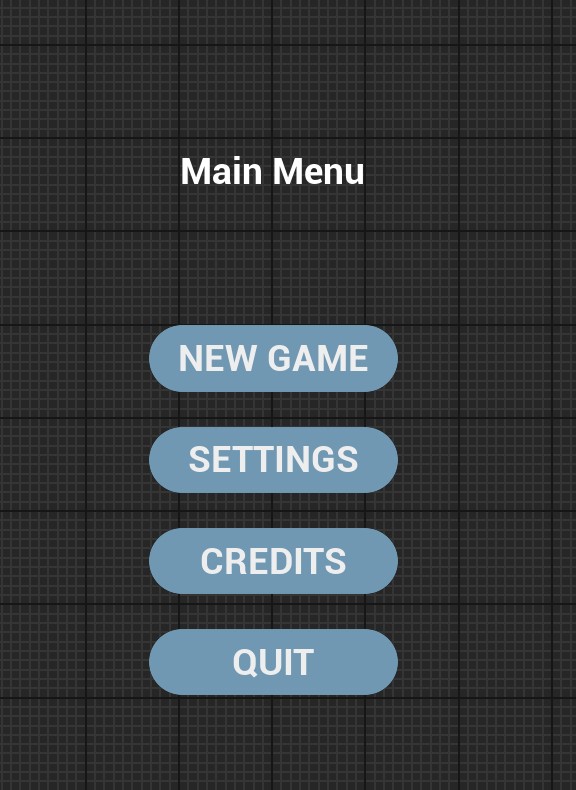 Main Menu widget with styled buttons
What is Common UI
Common UI is a plugin made by Epic Games for Unreal Engine. It was first released for 4.27. It comes with substantial enhancements for navigation, interactivity, layout and styling.
Within the plugin, you can find multiple enhanced versions of existing UMG widgets, like text blocks and borders or images. All new widgets have a style class that can be reused. Keeping all the styling in one place. It also features a new input routing system that allows you to manage gamepad focus in multi-layered UI systems.
How to get started
Open your Unreal project and go to Edit > Plugins and search for Common. Enable the Common UI plugin and restart your editor.

Alternatively, you can edit your .uproject file like so to enable the plugin:
{
  "FileVersion": 3,
  "EngineAssociation": "5.4",
  "Category": "",
  "Description": "",
  "Modules": [
   // ...
  ],
  "Plugins": [
    {
      "Name": "CommonUI",
      "Enabled": true
    }
  ]
}
Note
The tutorial repository has the plugin already enabled, because it is referenced by another plugin.
When now entering PIE mode you will get a nasty error message:
LogUIActionRouter: Error: Using CommonUI without a CommonGameViewportClient derived game viewport client. CommonUI Input routing will not function correctly.
To disable this warning set CommonUI.Debug.CheckGameViewportClientValid=0 under [SystemSettings] in your project's DefaultEngine.ini.
That’s because the plugin depends on a special version of the viewport class. The viewport controls how user input is routed through the entire application. Without changing the viewport, the input routing aspect of Common UI won’t work. More information on the topic can be found here.
To fix this go to Edit > Project Settings… and search for viewport. Change the Game Viewport Client Class to CommonGameViewportClient and restart the editor.
 Changing the viewport class
Creating a new Button Class
To fully utilize the styling features of Common UI, we need to create our own button class inheriting from UCommonButtonBase. First, add the UMG and CommonUI module to the list of dependencies in your projectName.build.cs file. Both are necessary to use UMG or CommonUI classes in your c++ code.
public class Tutorials : ModuleRules
{
	public Tutorials(ReadOnlyTargetRules Target) : base(Target)
	{
		PCHUsage = PCHUsageMode.UseExplicitOrSharedPCHs;

		PublicDependencyModuleNames.AddRange(new string[] { "Core", "CoreUObject", "Engine", "InputCore", "EnhancedInput", "UMG", "CommonUI" }); // <== here!

		PrivateDependencyModuleNames.AddRange(new string[] { "MyPlugin" });
	}
}
Warning
The step above is crucial! Without it, you won’t be able to compile your code.
Create a new class and use UCommonButtonBase as the parent. I named mine UCustomButton:
#pragma once

#include "CoreMinimal.h"
#include "CommonButtonBase.h"
#include "CustomButton.generated.h"

class UCommonTextBlock;

/**
 *
 */
UCLASS()
class TUTORIALS_API UCustomButton : public UCommonButtonBase {
    GENERATED_BODY()

protected:

    UPROPERTY(meta = (BindWidget))
    UCommonTextBlock* ButtonTextBlock;

    UPROPERTY(EditAnywhere, Category = "Button")
    FText ButtonText;

    virtual void NativePreConstruct() override;

};

// ============= cpp =================================
#include "Widgets/CustomButton.h"

#include "CommonTextBlock.h"

void UCustomButton::NativePreConstruct() {
    Super::NativePreConstruct();

    ButtonTextBlock->SetText(ButtonText);
}
First, we declare a text block widget using a macro and a meta tag: UPROPERTY(meta = (BindWidget)). The UPROPERTY macro exposes our text block to the reflection system. This way, it is visible in the editor. The meta tag BindWidget binds our pointer to a widget inside the editor with the same name and type. We will get to this later.
Next, we declare another property for the text the button should display. Lastly, we override the NativePreConstruct function. This function is called at runtime and inside the editor and allows us to preview our widget in the widget editor. Here, we take the text property and set its value for the text block.
Creating the Main Menu Class
Next, we create our main menu class.
#pragma once

#include "CoreMinimal.h"
#include "CommonUserWidget.h"

#include "MainMenuWidget.generated.h"

UCLASS()
class TUTORIALS_API UMainMenuWidget : public UCommonUserWidget {
	GENERATED_BODY()
};
As you can see, we inherit from UCommonUserWidget. This class directly inherits from UserWidget, the default UMG widget class. This class gives us easy access to the UCommonInputSubsystem, which we will need later on.
We start by declaring some buttons for our main menu and binding them in the NativeOnInitialized function. This function is only called once, after the widget is constructed.
#pragma once

#include "CoreMinimal.h"
#include "CommonUserWidget.h"

#include "MainMenuWidget.generated.h"

class UCustomButton;

UCLASS()
class TUTORIALS_API UMainMenuWidget : public UCommonUserWidget {
    GENERATED_BODY()

protected:
    UPROPERTY(meta = (BindWidget))
    UCustomButton* NewGameBtn;
    UPROPERTY(meta = (BindWidget))
    UCustomButton* SettingsBtn;
    UPROPERTY(meta = (BindWidget))
    UCustomButton* CreditsBtn;
    UPROPERTY(meta = (BindWidget))
    UCustomButton* QuitBtn;

    virtual void NativeOnInitialized() override;

    virtual void OnNewGame();
    virtual void OnSettings();
    virtual void OnCredits();
    virtual void OnQuit();
};

// ============ cpp ===================================================

#include "Tutorials/Public/Widgets/MainMenuWidget.h"

#include "Widgets/CustomButton.h"

void UMainMenuWidget::NativeOnInitialized() {
	Super::NativeOnInitialized();

	NewGameBtn->OnClicked().AddUObject(this, &UMainMenuWidget::OnNewGame);
	SettingsBtn->OnClicked().AddUObject(this, &UMainMenuWidget::OnSettings);
	CreditsBtn->OnClicked().AddUObject(this, &UMainMenuWidget::OnCredits);
	QuitBtn->OnClicked().AddUObject(this, &UMainMenuWidget::OnQuit);
}

void UMainMenuWidget::OnNewGame() {
	// TODO:
}

void UMainMenuWidget::OnSettings() {
	// TODO:
}

void UMainMenuWidget::OnCredits() {
	// TODO:
}

void UMainMenuWidget::OnQuit() {
	// TODO:
}
Inside the NativeOnInitialized function, we bind the buttons click events to the corresponding functions. Since, our class ultimately inherits from UObject, we can use the AddUObject function to bind our events.
Note
When using AddUObject to bind a function to a delegate, the function does not need a UFUNCTION macro.
Alright, with this done, let’s compile and (re)start the editor. Create a widget blueprint by right clicking inside the content browser and go to User Interface > Widget Blueprint. Select the MainMenuWidget as the parent class and click Select.
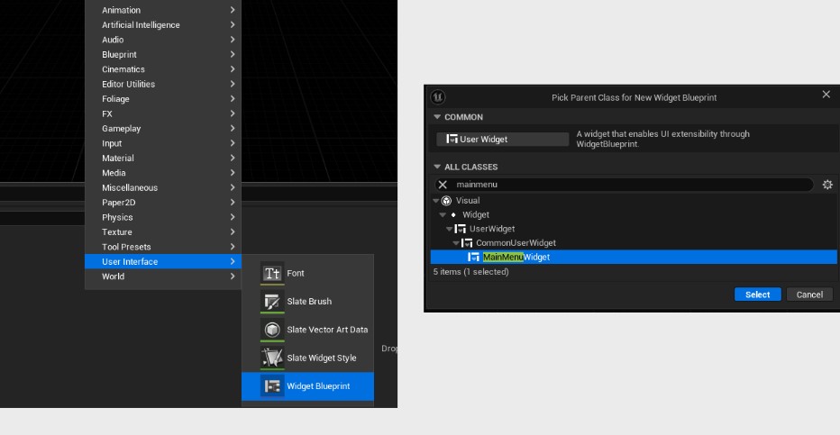 Creating a widget blueprint
Tip
If you selected the wrong parent class in the creation dialog. You can still change the parent class inside the widget editor by going to File > Reparent Blueprint. Now, simply select for desired parent class.
After that, we create another widget and use the UCustomButton as parent class. Open the button widget and add an overlay. Next, add an CommonTextBlock widget to the overlay. The name of the text block widget needs to match the name of our property. So make sure you got the spelling right.
 Button widget hierarchy
If you edit the ButtonText property on the widget itself the text inside the button should also update.
Let’s open the main menu widget now. First, drag an overlay widget from the palette onto the canvas. Next, add an vertical box to the overlay and align it vertically and horizontally centered. Add four button widgets to the vertical box and make sure you use the blueprint version and not the native version. Next, change the names of the buttons, so they match with the properties declared in our code. Otherwise, the blueprint won’t compile. Feel free to add some padding to the buttons. I also added a title text.
Styling
Now, that we have our general layout complete, it is time to start styling our buttons. In order to use CommonUI’s extensive styling features, we create a new blueprint and select CommonButtonStyle as a parent.
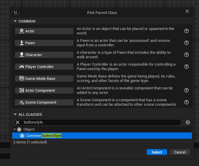 Creating a style blueprint
Name it BP_ButtonStyle and open it. The blueprint only contains data and holds no logic. Thus, the only interesting part about it is the properties panel.
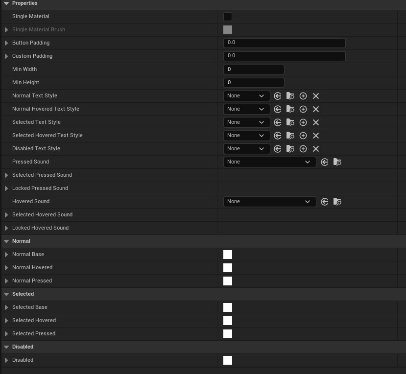 Button style properties
Most of these properties are self-explanatory. The different text styles can be used to display different text styles for each button state. The same goes for the Normal and Selected brushes at the bottom. These are also applied to the corresponding button state.
Edit the brushes to your liking and create a new blueprint. This time select CommonTextStyle as the parent class. Call the blueprint BP_ButtonTextStyle and edit the properties to your liking. Do not forget to set a font!
Tip
If you do not set a font, your text boxes will display cryptic looking characters. If the font combo box is empty, enable the Show Engine Content checkbox by clicking on the gear icon.
Assign the text style to the button style’s text style properties and save everything. Now, open the WBP_Button blueprint and assign the BP_ButtonStyle to the widget and compile. Click on the root element in the hierarchy to select the button widget itself. The button and the text should update according to the text style.
Next, open the WBP_MainMenu, select all buttons and assign the new button style and compile. While we’re at it, we change the text of all the buttons to something more meaningful.

To quickly test the widget: create a new map, open the level blueprint and add the widget in the BeginPlay method:
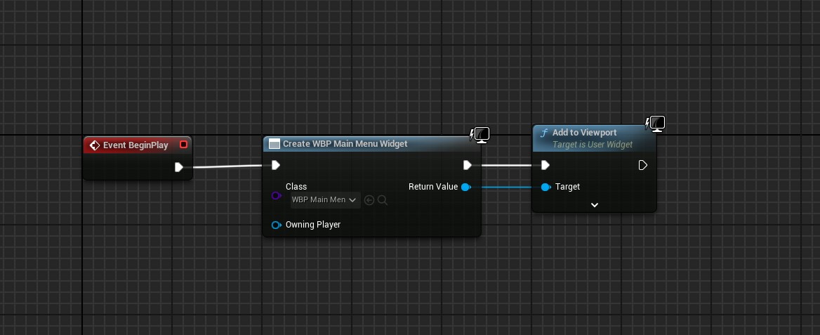 Add widget to viewport
In the next part we start working on gamepad navigation and button binding.